Along with décor and ambiance, the menu is an important factor when deciding where to dine. And it’s not just the food on offer that contributes to this first impression: the design is important too. Whether your client is a brand new, trendy coffee shop, a well-established and upmarket restaurant or a family-owned-family-friendly diner, the menu should shout out loud what the place is all about.
With so much on the line, careful consideration should be given to colour scheme, typeface, imagery and layout. We found 15 examples of menu designs that are getting it right.
Drink Menus
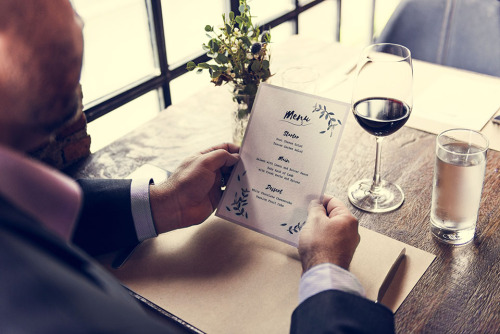
A gloss finish is perfect for highlighting the bright colours often used in drink menus. A dark background can be used to contrast brightly coloured cocktails, or the deep red in this wine list.


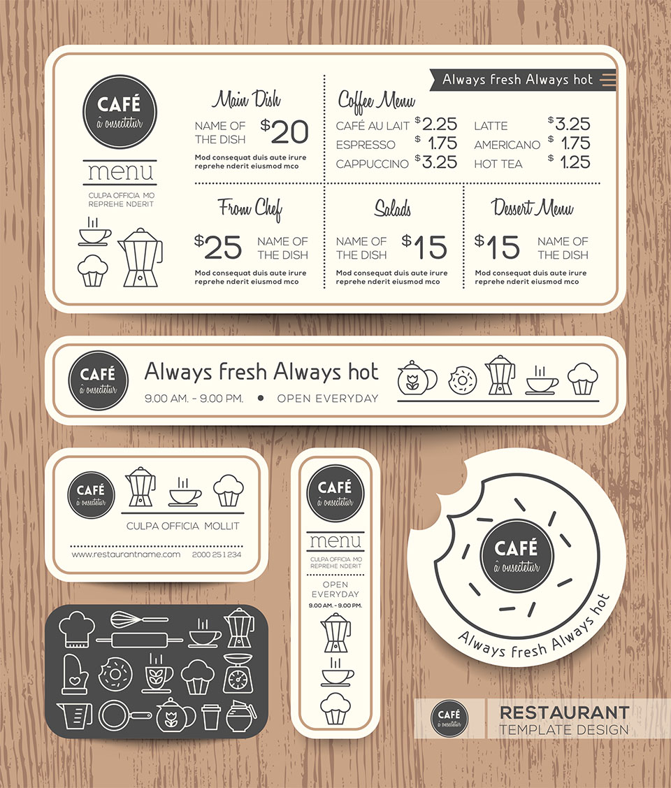
Coffee Shops
Colours inspired by nature such as whites and greens give a fresh and airy look to these coffee shop menus. Fun, hand-drawn images add a casual edge, while leaves indicate organic produce and suggest an environmentally conscious company.

Gastropubs
A simple, clean design is the perfect option for a Gastropub. With stripped back design, lots of white space, and minimal use of colour, these menus indicate a no fuss, laid back dining experience.


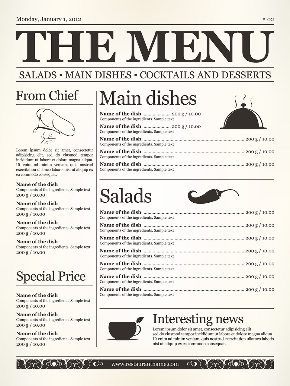
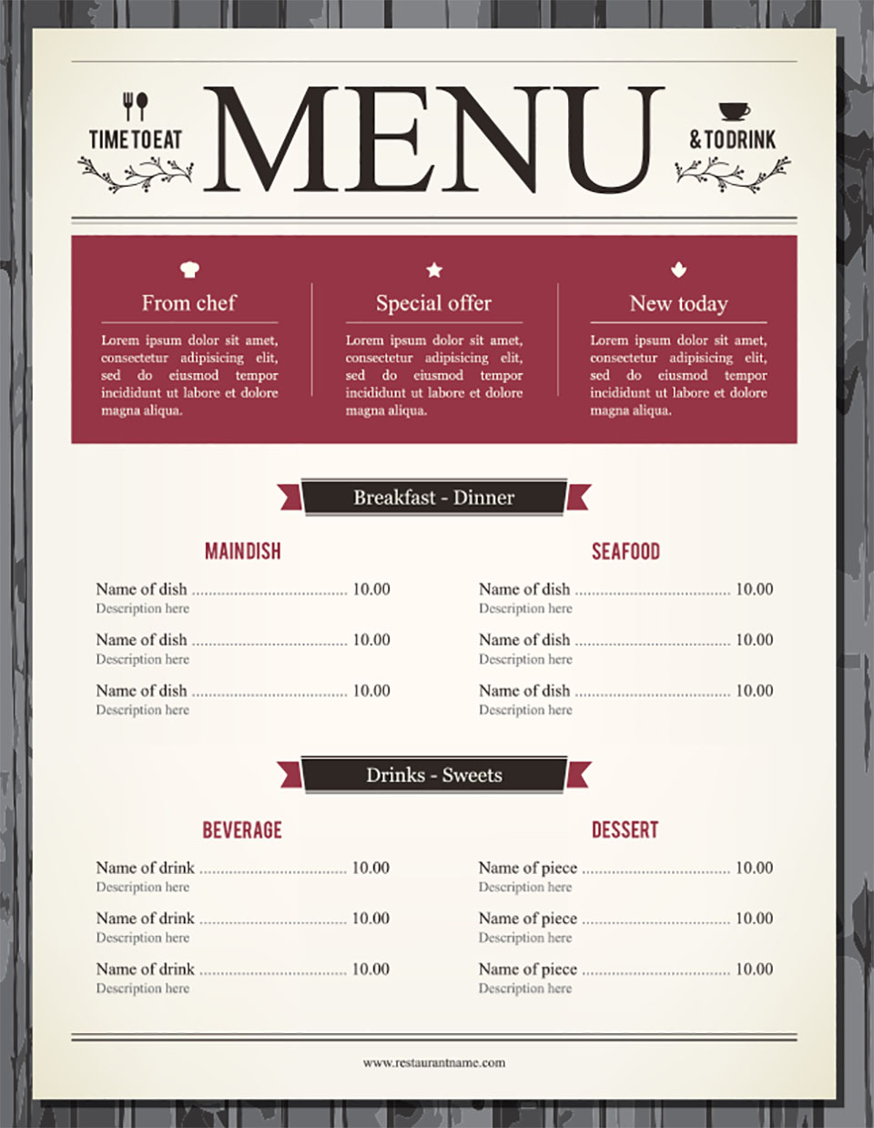
Upmarket Restaurants
Similar to the Gastropub, menus for an upmarket restaurant focus on a stripped back design and make minimal use of colour. The focus in these menus though is expensive ingredients and exclusive food, therefore a high quality paper complements their brand.


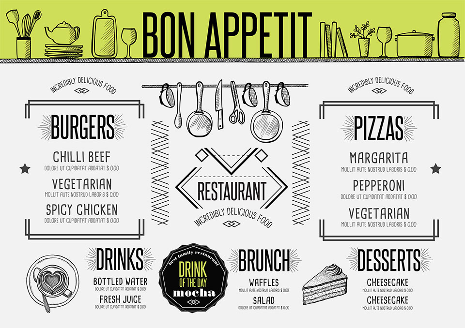
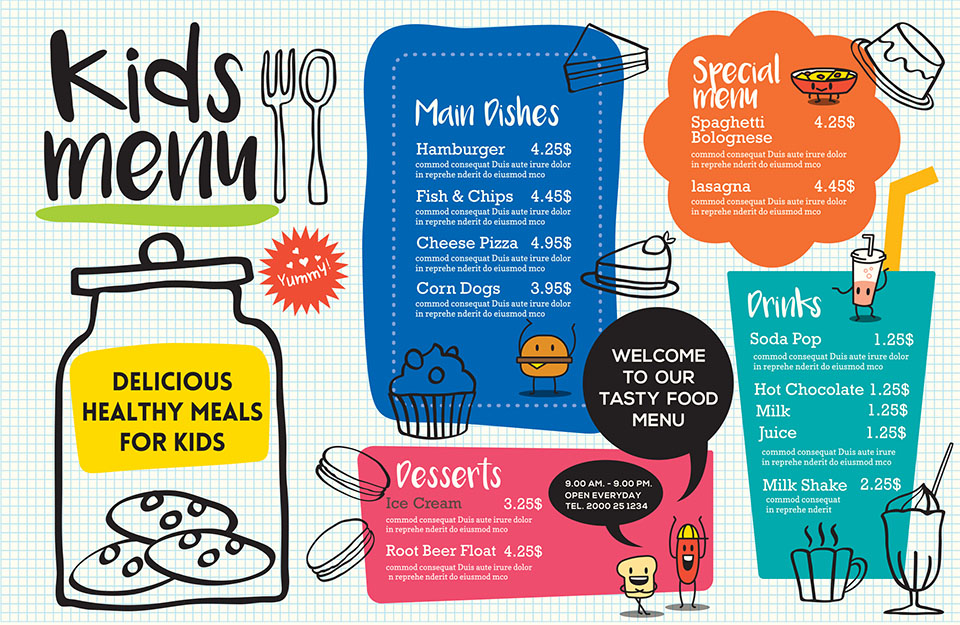
Family friendly
Bright colours and fun cartoon drawings help keep the kids engaged while the parents order the food! For potentially messy diners, a wipe clean or disposable menu is preferred.


Now that you’ve designed the perfect menu, you need to decide what to print it on. We would recommend our 450gsm gloss and 400gsm matt laminated flyers. These brand new products are the heavy weights of our flyer range, and ideal for a single page, single or double sided menu.